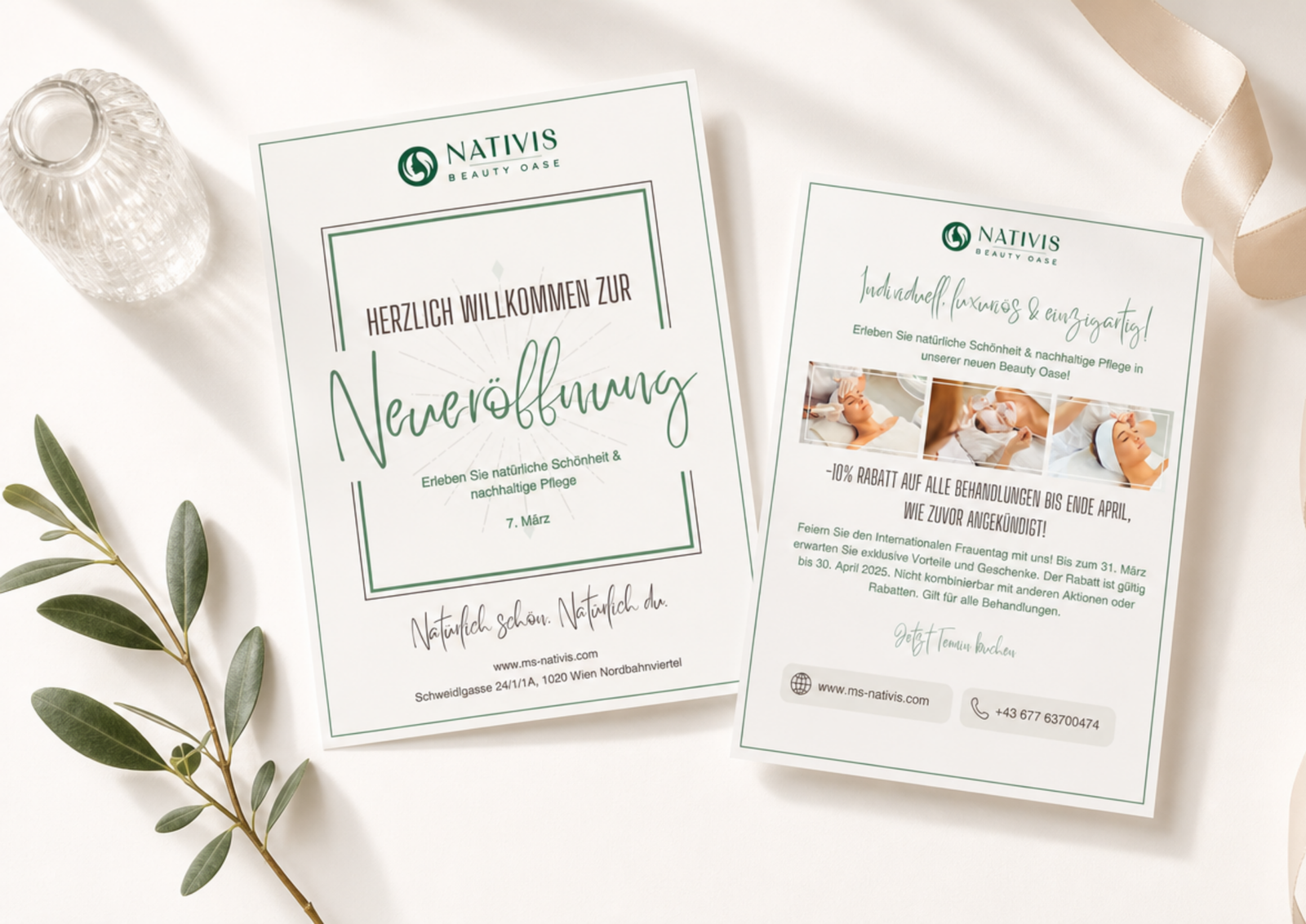
Nativis Beauty Oase
A complete brand identity and print & digital collateral system for a premium skincare and wellness studio in Vienna.
I refined the logo, built a controlled identity system and designed the studio's full suite of print and digital materials.
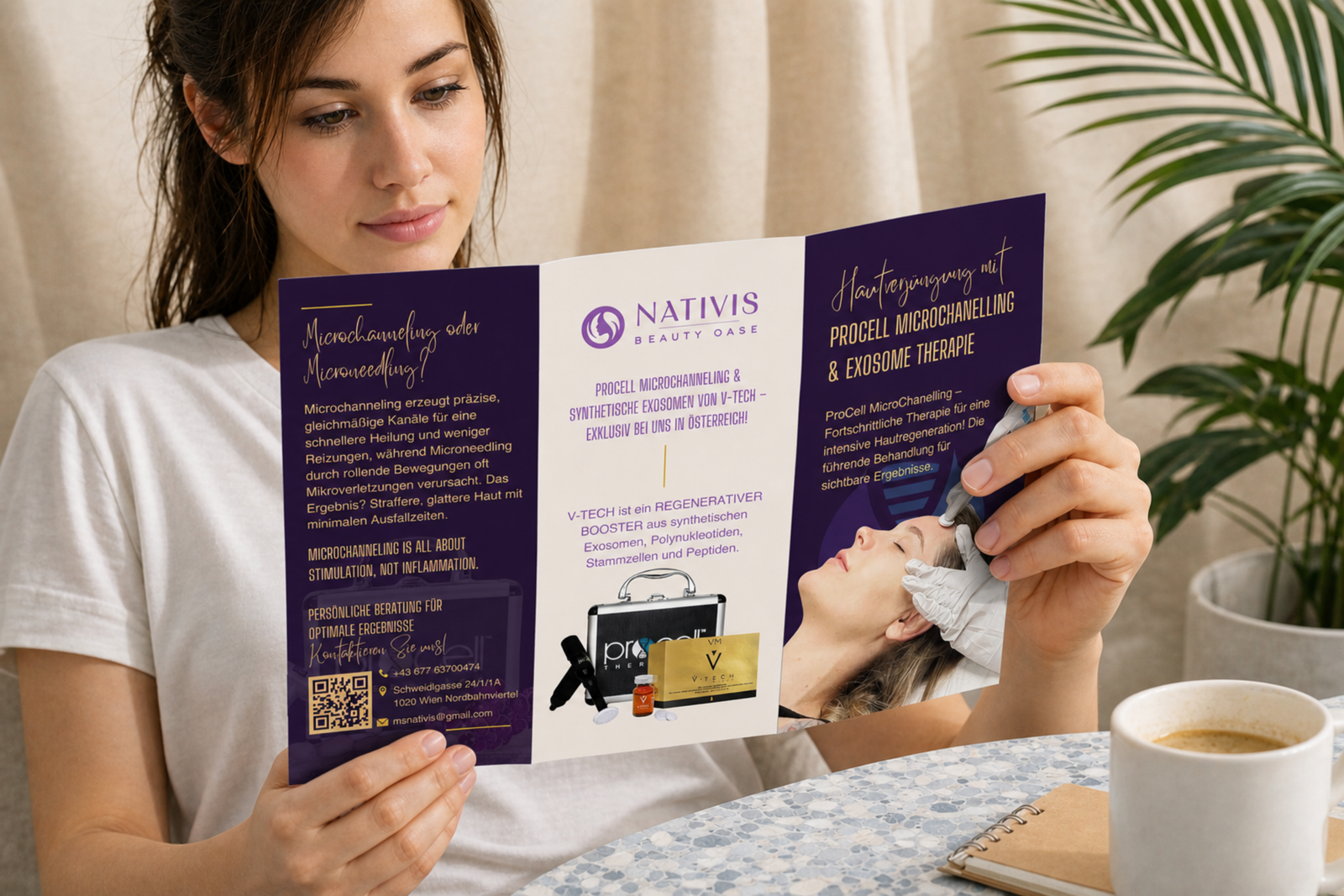
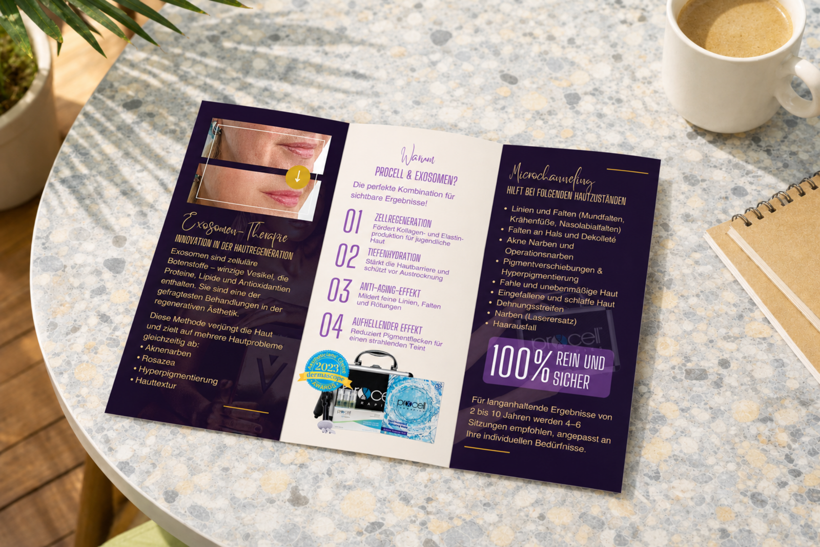
The studio needed one coherent identity while working with partner skincare brands (DermaOxy, ProCell and Exosome Therapy), each with its own visual style. Visual assets were limited and content arrived scattered across dozens of emails.
I built a structured identity system around a controlled colour palette, refined typography and strict layout rules. Stock photography and partner colours were adjusted to fit Nativis's luxurious yet approachable tone, and I refined the original logo for legibility and balance without losing recognition.
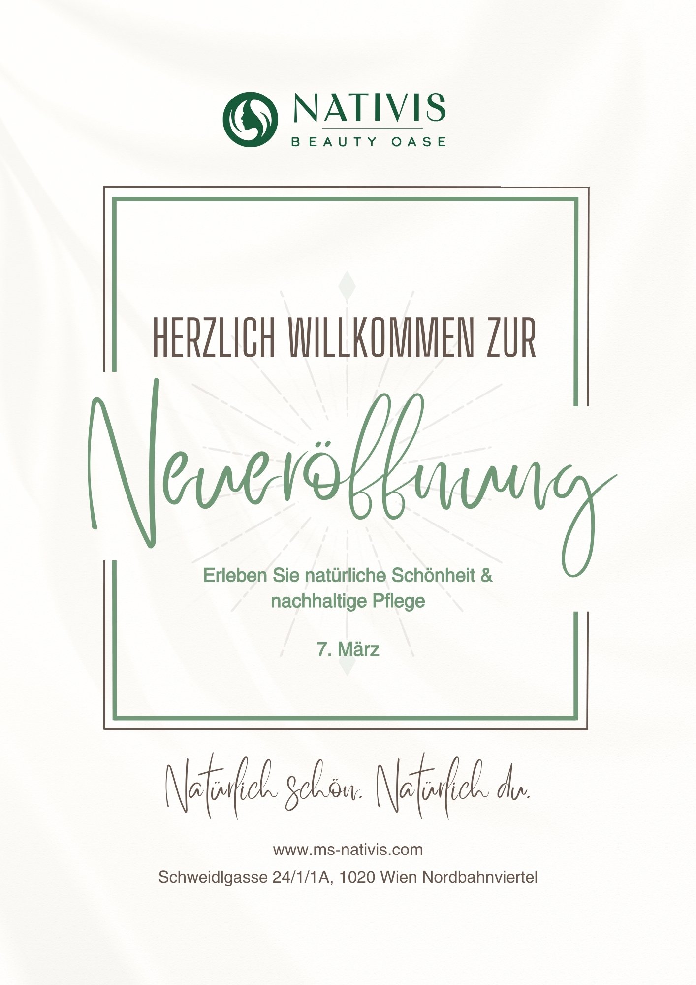
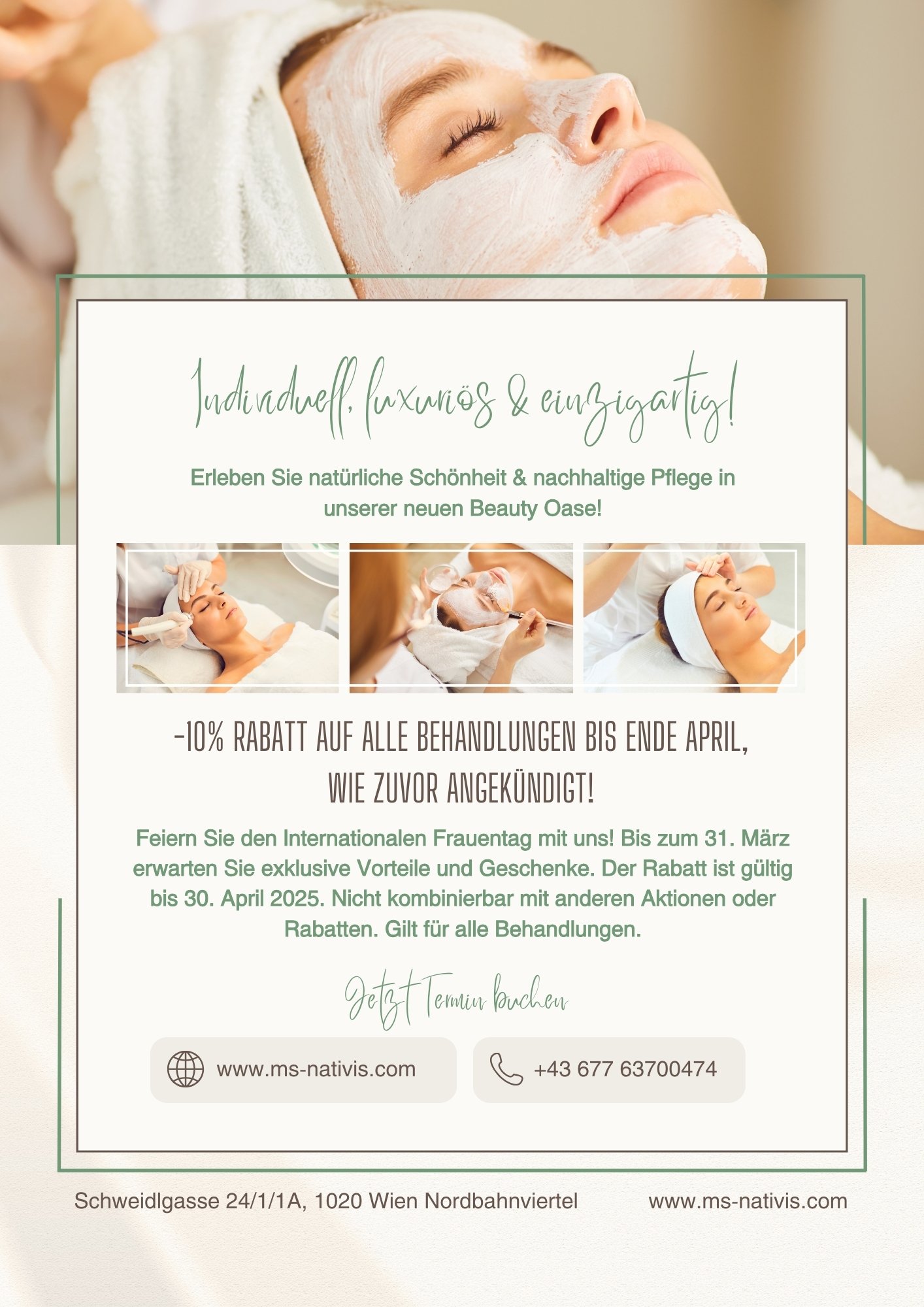
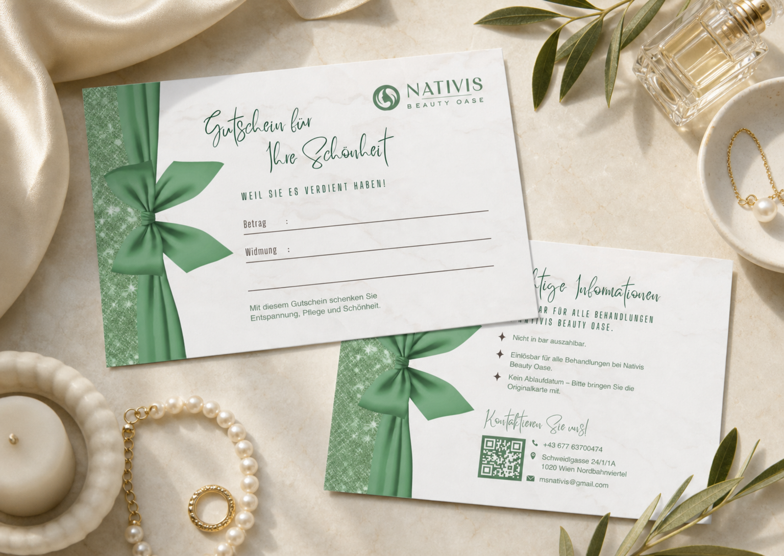
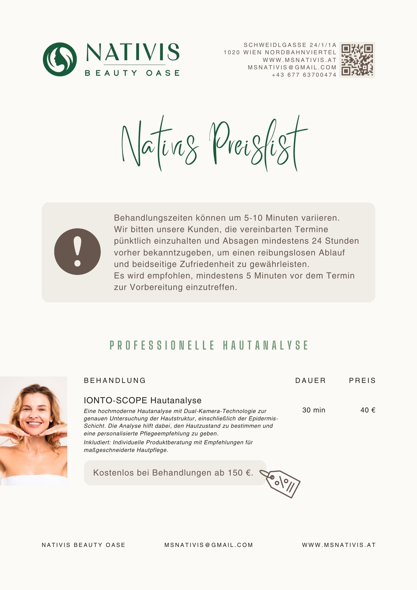
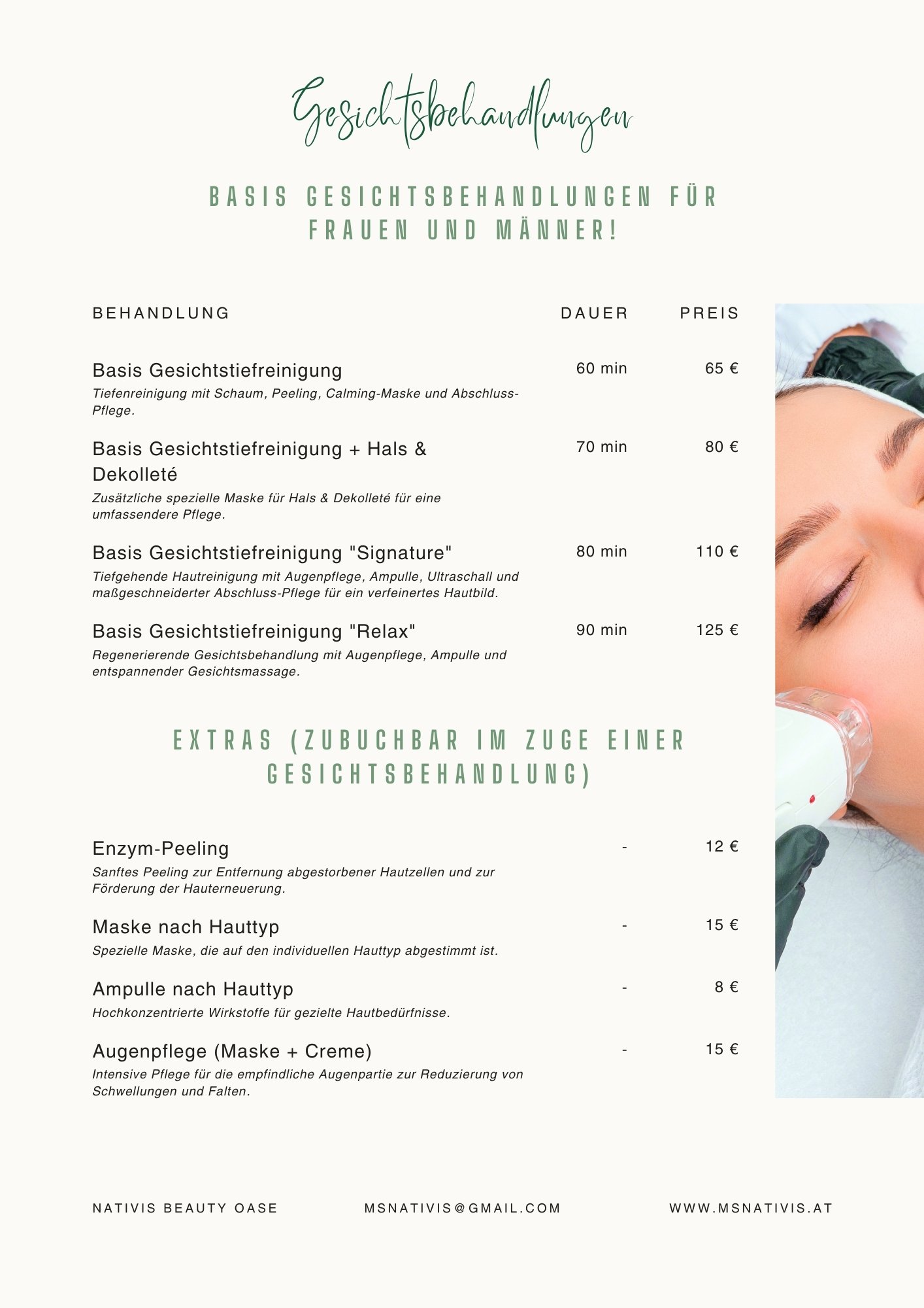
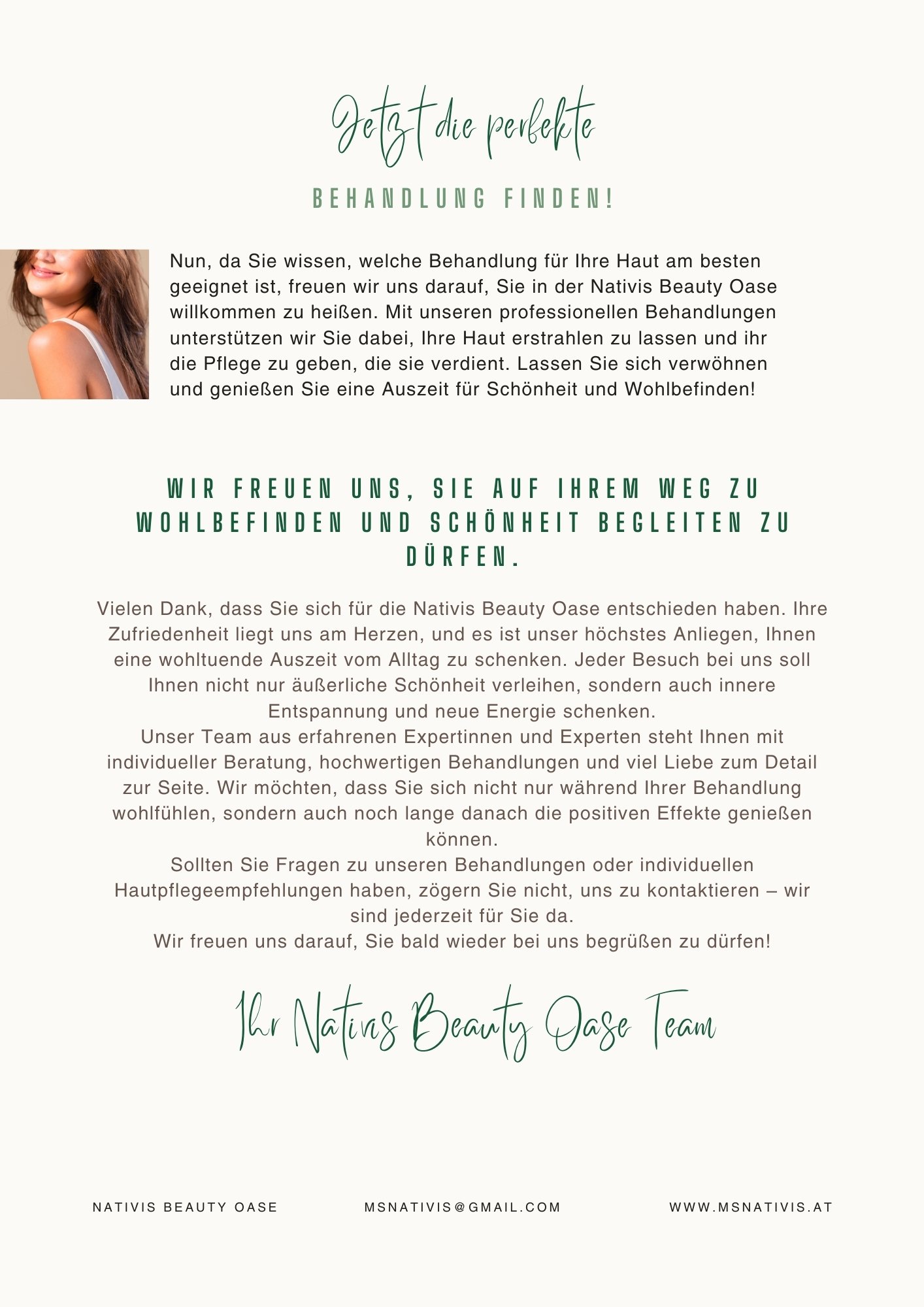
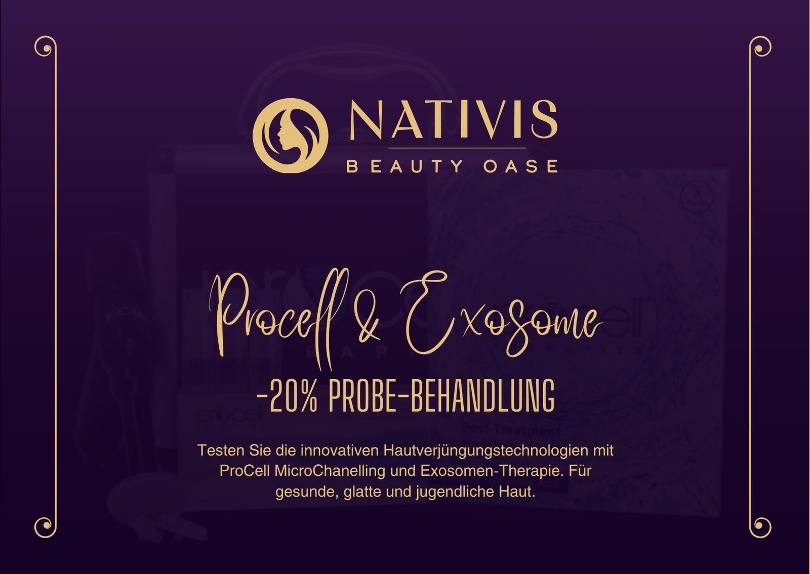
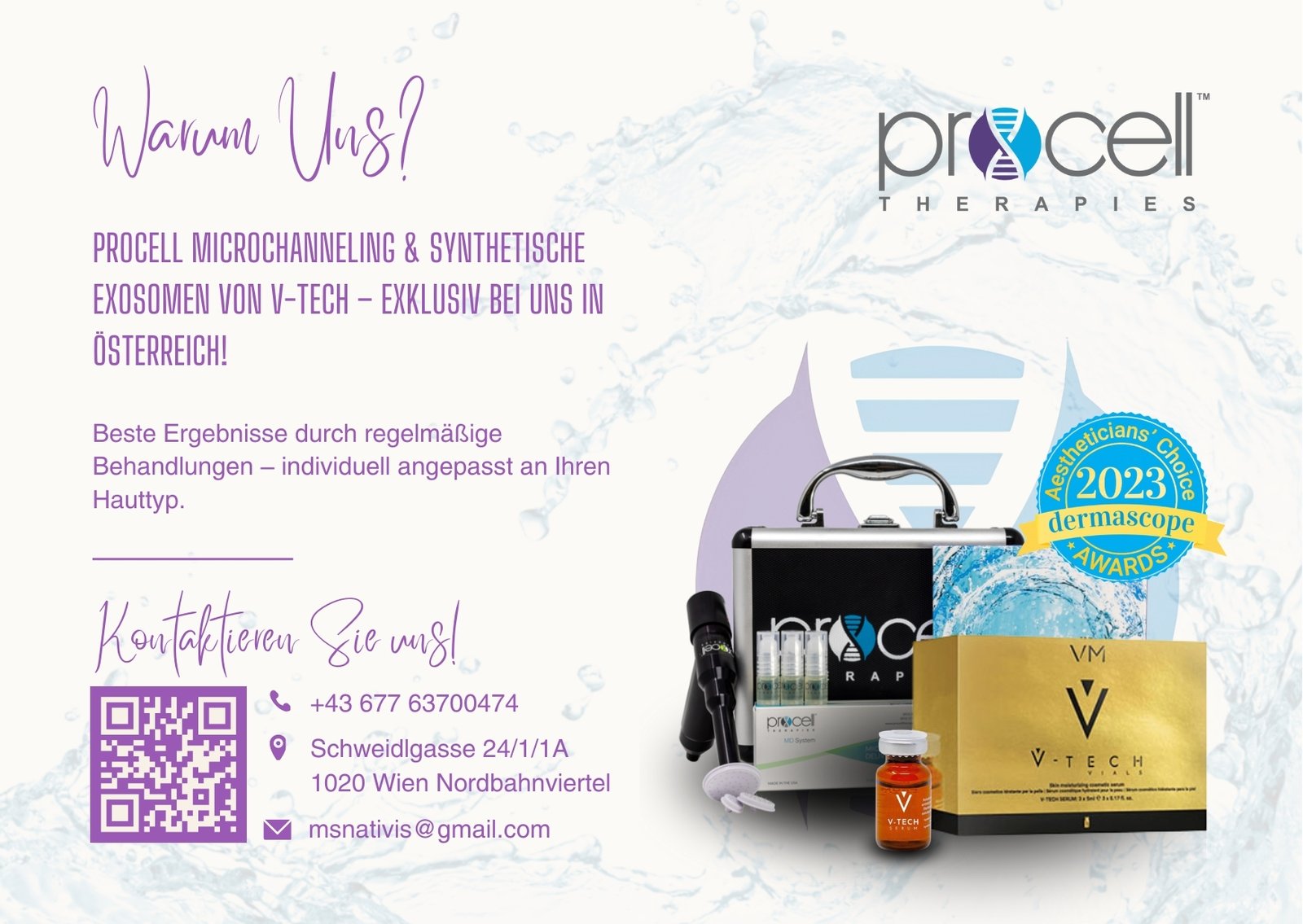
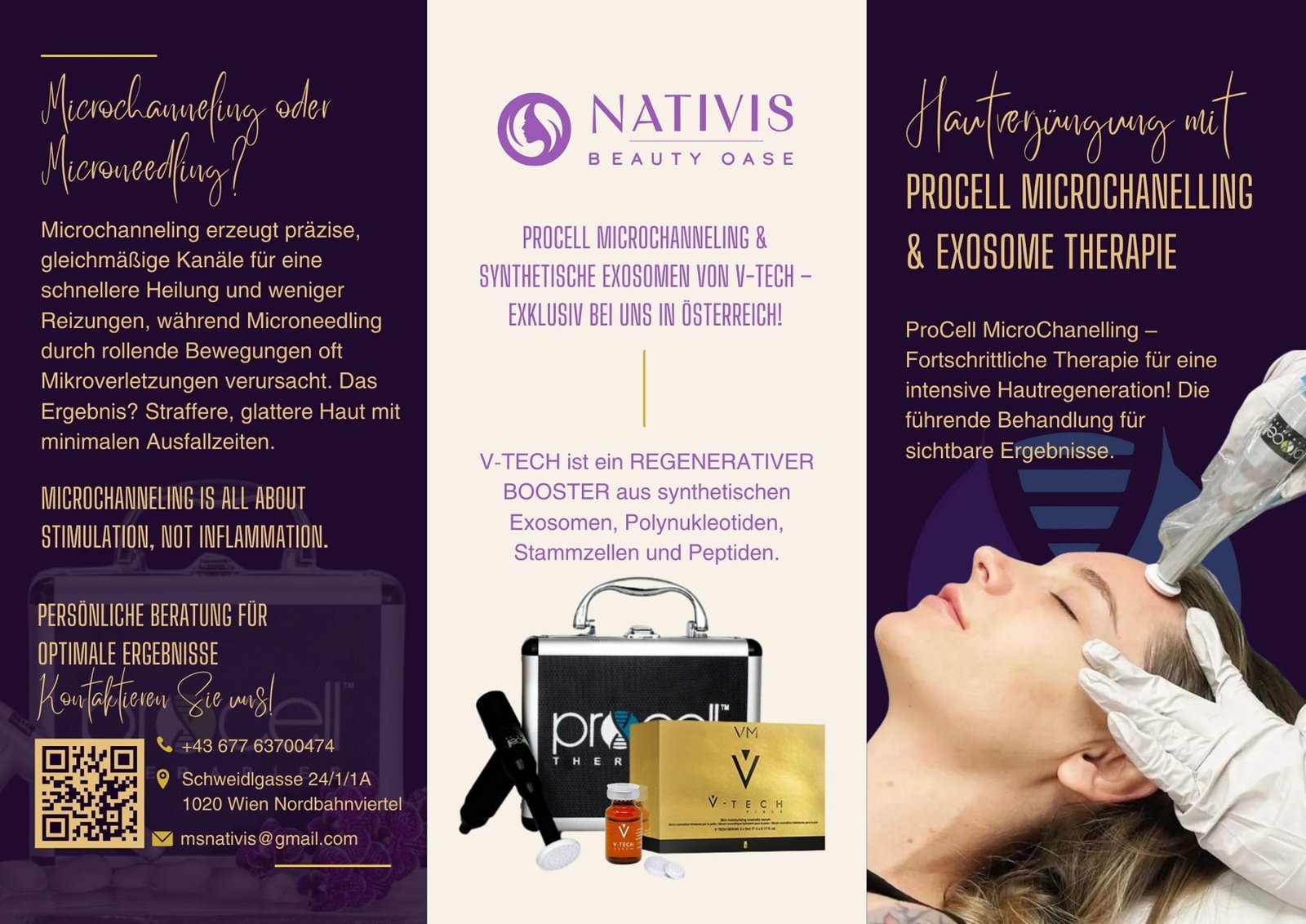
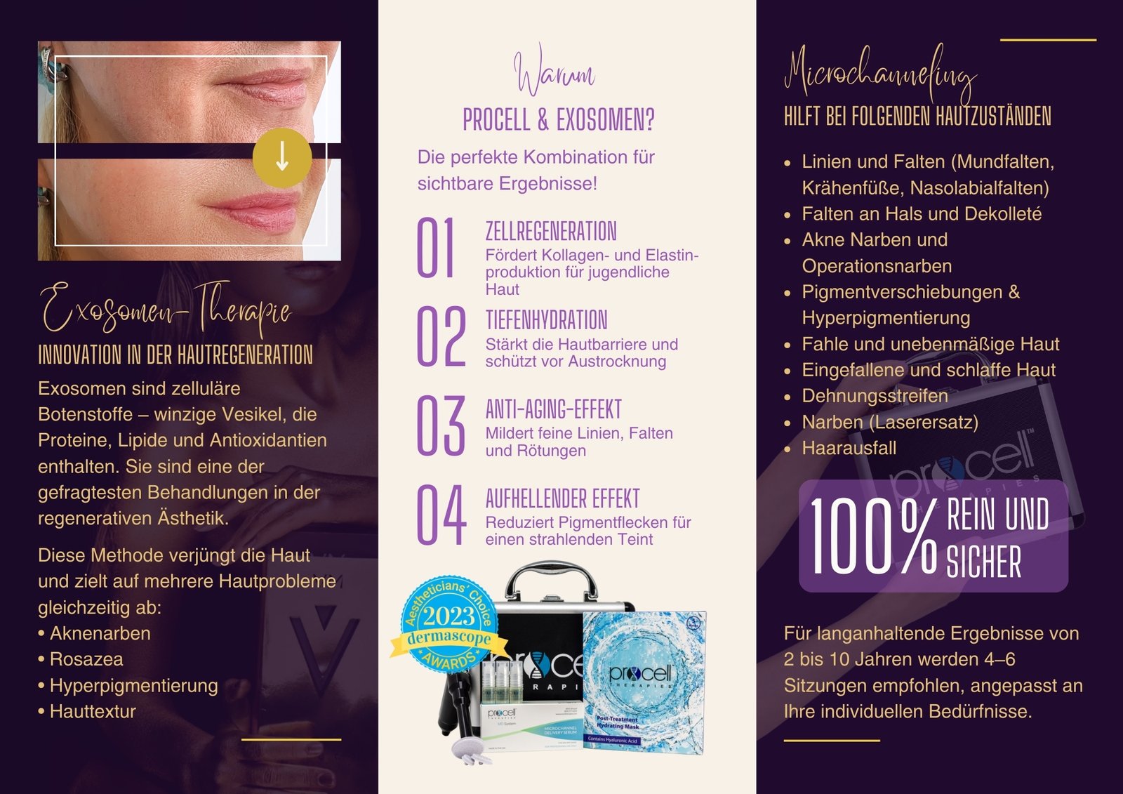
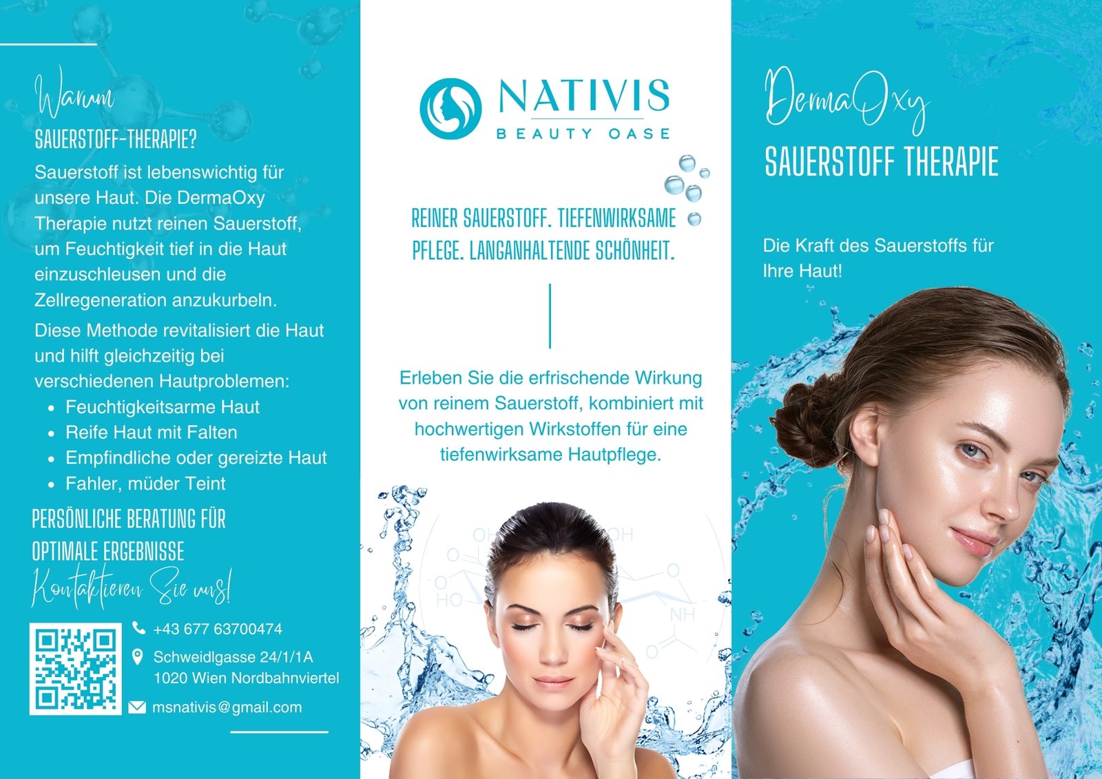
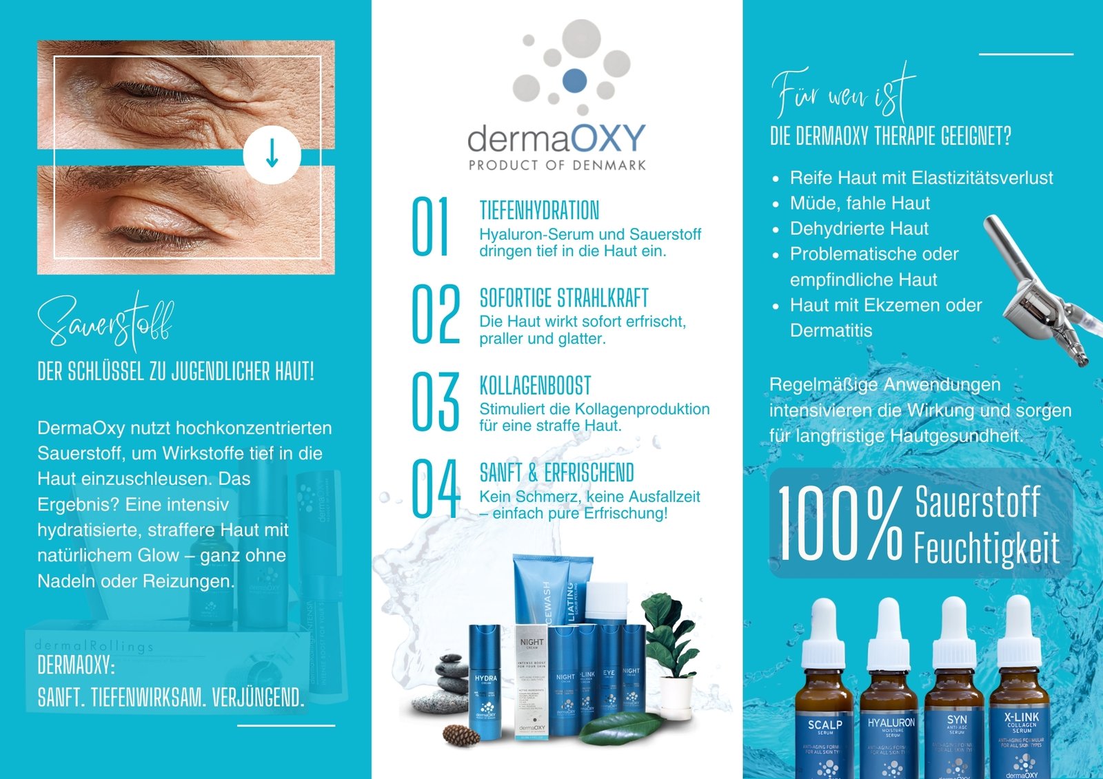
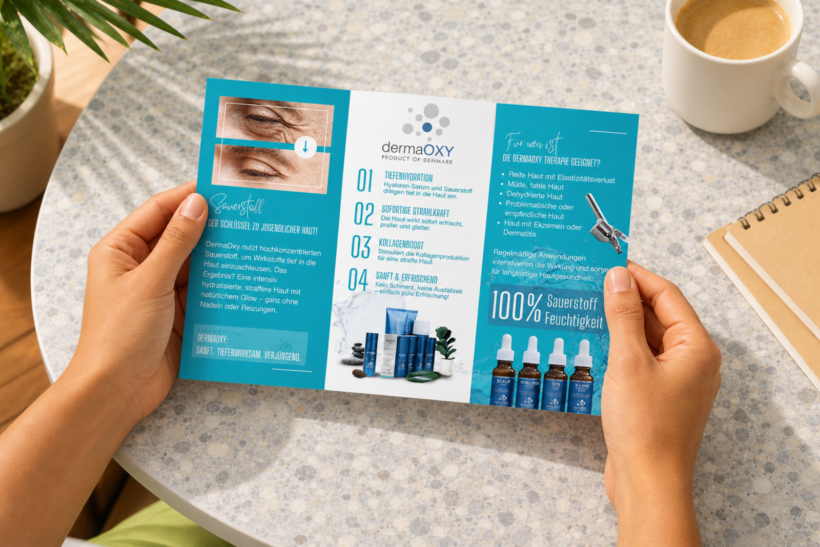
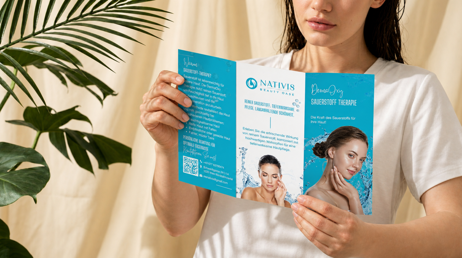
A detailed service & pricing guide, a grand-opening print suite and a German version of the studio's website.
What I delivered
A multi-page service & pricing guide that organises complex treatment information (Hydroabrasion, DermaOxy oxygen therapy, anti-aging) into a clear hierarchy, with guidance on choosing the right facial for each skin type. Service cards, invitations and flyers for the grand opening, plus the original Croatian website localised into German with AI-assisted workflows.
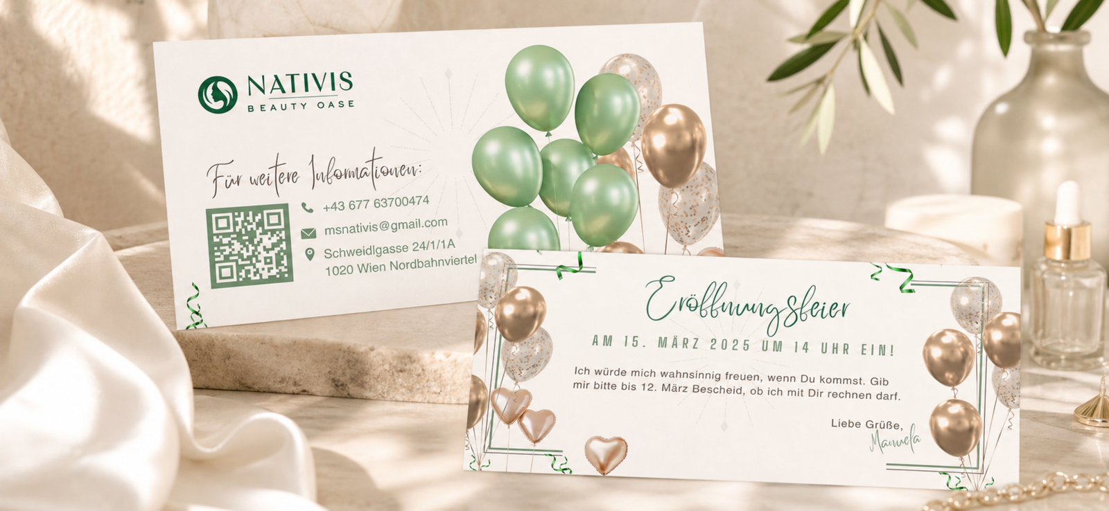
Despite fragmented input and mixed partner colour systems, the studio gained a polished, luxurious brand language that communicates clarity, expertise and care.
The outcome